Default
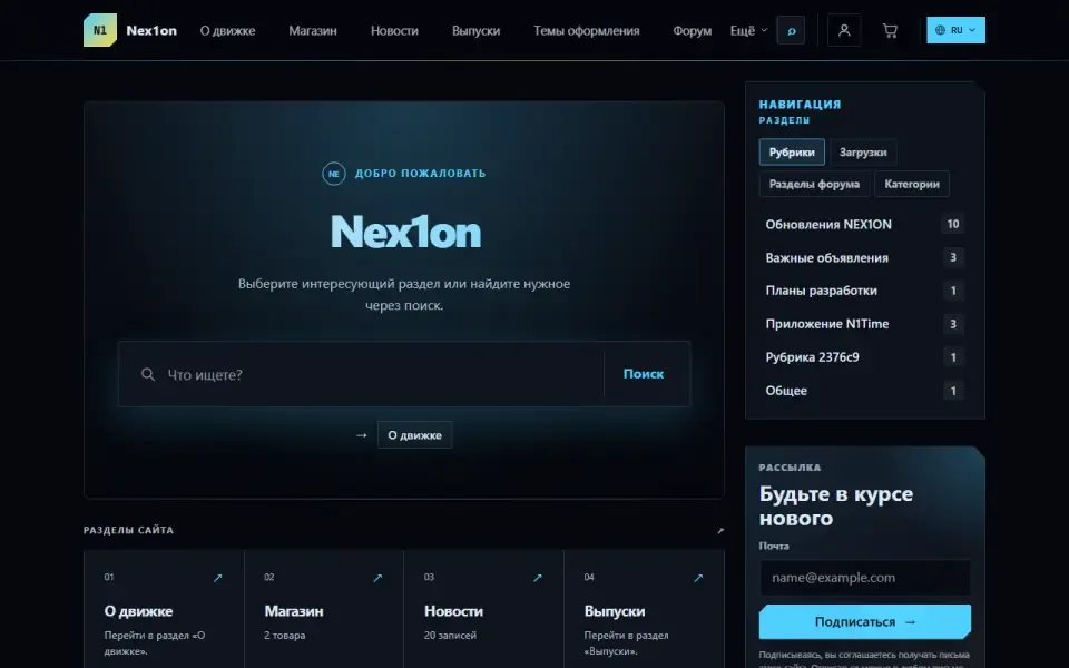
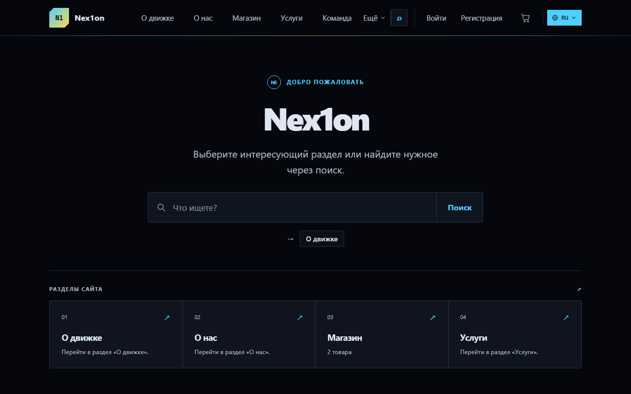
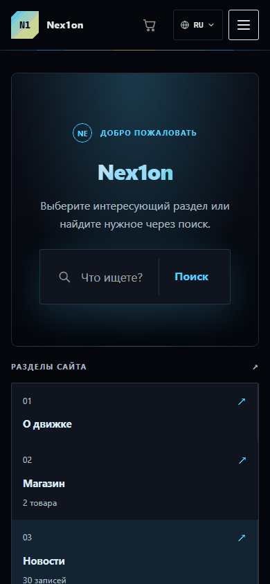
The engine's base dark theme: a deep background with a faint grid, panels with a cut corner, letter-spaced monospace labels and a light-blue accent. A starting point for your own theme.
Look
A dark theme in the spirit of an instrument panel. A near-black background with a faint grid and two glows, panels with a cut corner, and a glowing border that brightens on hover. Labels are set in letter-spaced monospace, like instrument readouts. The accent is light blue, the secondary colour yellow, and the font is the system sans-serif. Motion appears only where it tells you something, and it switches off entirely if the visitor has asked the system for reduced motion. The theme tells the browser that it is dark, so dropdowns, date pickers and scrollbars are dark too. Suits technical projects, services and communities; a convenient base for your own theme.What you can configure
In the admin panel: «Appearance», part «Colours & fonts». Settings apply to the active theme: changes show at once in the site preview window, and visitors see them after «Publish». An empty field means «as the theme intended».- Colours: accent colour (#4fd0ff), secondary colour (#ffd84d), background (#05070d), panels, text.
- Fonts: body font and heading font — as a font stack, from the preferred one to the fallback.
- Geometry: corner radius (3px), logo height (40px), content width (1120px).
- Product cards: minimum width, photo shape (square, 4:3, 3:4, 16:9) and photo fitting — crop to fill or fit whole.
- Shared by the official themes: text scale, header height, spacing, sidebar width, card, button and field radius, card density and shadow, motion speed.
Block places
Eight places; each theme has its own arrangement, changed in «Appearance», part «Home & blocks»: home introduction, home page (module sections shown only on the home page), header icons next to the language switcher, header, above the content, below the content, sidebar (appears only when something is placed in it) and footer.Installation
The theme ships with the engine: it has no tables, permissions or data. It is switched on in «Appearance», part «Theme», with the «Make active» button. The theme contains no templates: the markup is shared and comes from the core, so modules take on its look straight away.Version history
1.0.0
- The engine's first theme, released together with the core: dark background with a grid, panels with a cut corner, monospace labels
- All colours, fonts, corner radii and widths moved into variables — they can be changed from the admin panel without editing files
- Since 7 September templates live in the core, and the theme is responsible only for the look
- Fixes without a version bump: theme screenshot in the admin panel, module sections on the home page, shop storefront and cart in the header, label contrast raised to standard, menu and footer on phones, touch targets at least 44 points